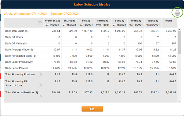
This report breaks down your schedule each day to give you a multitude of categories to look at in regards to your schedule. You can use this report to see you overall labor numbers, forecasted labor percent, forecast labor dollars, and labor hours and dollars broken out into each position.
To get to this report:
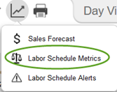
- Once you have started working on a schedule, you can view this report to see the metrics of what you have scheduled already for that week. It’s best to look at this report once you feel like you have completed your schedule but before you post to make sure it aligns with your forecasted covers. While looking at the schedule, click on the graph icon on the top right corner (this can be seen in both the Day View and the Week View).

- This will provide a dropdown menu, and you should choose Labor Schedule Metrics

- The report will look like this, but as you scroll down you will have the ability to expand which ever category breakdown you would like to see. (If you would like to print out this report, you can do that by clicking the print icon on the top right corner of that window. It will only expand the categories that you have expanded on the screen, so make sure to dive into the categories you want to look at before printing.)

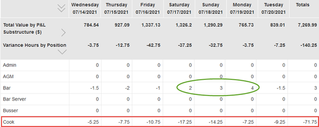
- If you scroll down to the category that says Variance Hours by Position this will give you a clear indication of where you have scheduled more or less in each position compared to the ideal hours based on the forecasted covers. A negative number here shows that you have over-scheduled that position (shown below in red) and a positive number means you have scheduled less hours in that positions that the forecasted covers calls for (shown below in green).
